
THE LITTLE FLOWER WORKSHOP
Naming, branding, strategy and website.
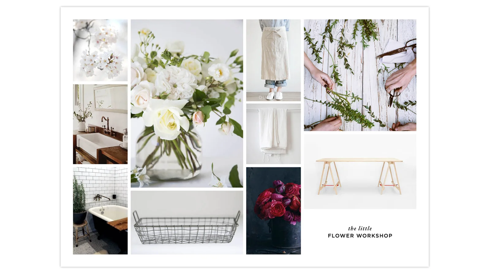
Name and brand a business that teaches the skills of floristry in a fun, charming and engaging manner.
The Approach
The typographic mark is a combination of serif and sans serif fonts, bridging the gap between the classic and modern worlds of floristry. It occupies a space in the centre of a calm white area with lots of room, surrounded by a flash of colour. This calm is mirrored in the floor plan as the workshop is a white room with bursts of colour around the walls, where flowers sit in buckets. Occasionally, an entire macro image will be shown in full colour to accentuate the brand and provide a more striking language.
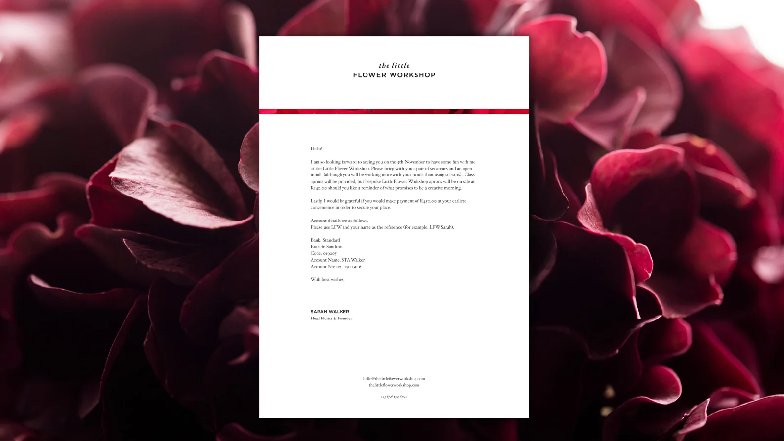
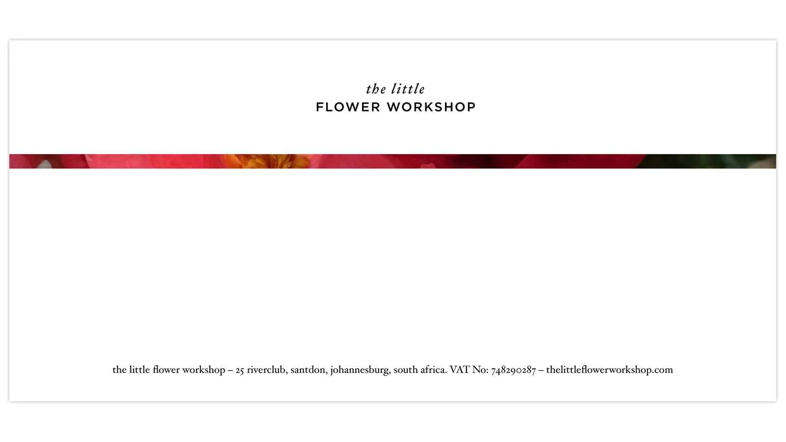
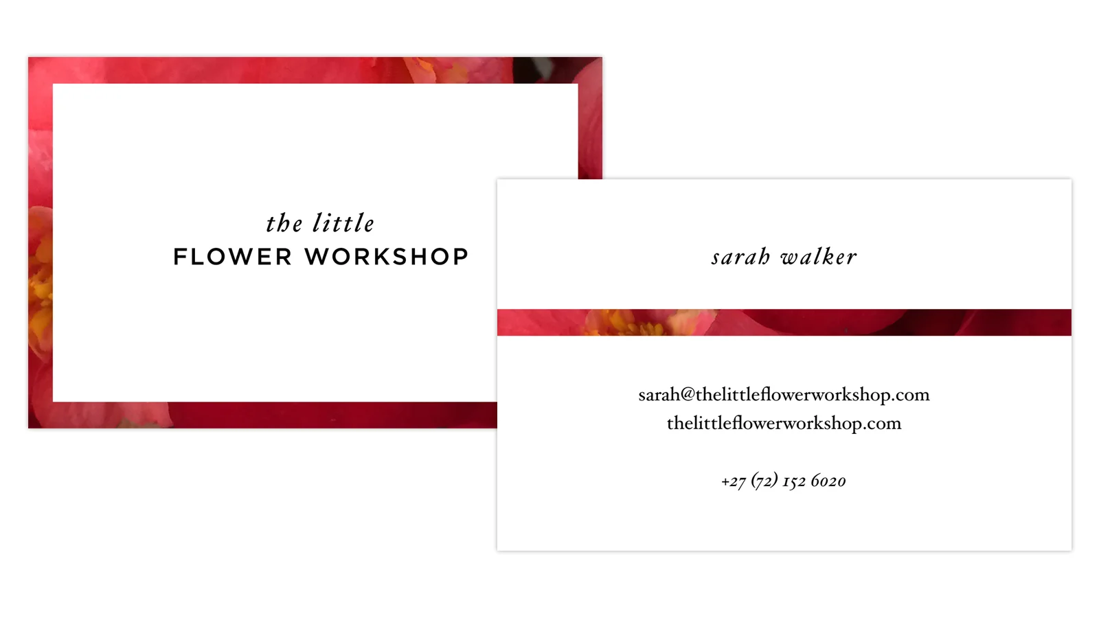
Stationery
A narrow border reveals part of a photograph of a single flower that shows something unexpected; a theme that is carried into the workshops.
Also need a project like this?